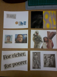
Match the words with the images This was the first piece of work that we were asked to do. Working in groups of four, we were asked to match the images to the words. The words we got were baby, make mistakes, experience required, make things happen, voice, and the last two images were ones we used without any words so that you can decide for yourself what the images mean to you. It shows a lifetime, starting as a baby, then we make mistakes and experience required is joined with the image of a bridge, to show that you have to come a long way to learn and can be like crossing a bridge, then the words make things happen and voice are put underneath each other because you make things happen with your voice, and the image of bright flowers seemed 'loud'. Towards the end, we put a church and the image of the house to show that people often turn to religion when they get older, and once they have passed away, its just closed off and cold, like the house filled with cement.p-The words and images flow and its obvious what the message is.
n-Working in a group of four, there was some disagreement to what should go where.i-The way people interpret the images and the sequence.____________________________________________________Image WorkshopThe image workshop started with a presentation. We saw how certain images, next to other completly diffrent images can mean different things. We also looked at different collage artists, and the one that stood out to me most was alan fletcher, who used scrap bits of paper and tickets to make all the animals that represent the chinese new year. Here are the images we were shown in the presentation.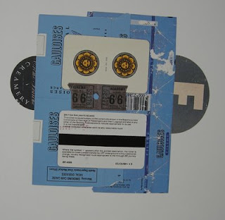
W
e were then asked to choose one of ten themes and produce a collage that shows the theme. we also evaluated and fed back on the work from the whole group afterwads. We were also asked to produce as many as we can in fifteen minutes, and I was able to make six altogether.
 This was the first collage that I did, the word I chose was contrast.
p- I like the way the images are and arent too 'busy' on the page, also its obvious what the word is that I chosen.
n- The words that I have could have been better, but because of the lack of time I couldnt find the matching one.
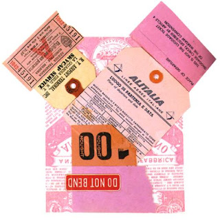
i- How one image next to another can mean complete different things.Here are the other six I was able to make in class in 15 minutes, also around the theme of contrast:
 However with these six, I found I didnt spend as long thinking about the ideas, and just picked up the first things that stood out to me that could mean contrast. This made me realise how much I can actually get done without thinking about things too hard, and making the task more difficult for myself.____________________________________________________
Research with OrlaghThis workshop involved us coming up with different types of research methods that i probably wouldnt have thought of in as much detail before. We were asked to discuss how different information could be recorded and collected in as many interesting ways as possible. We were put into pairs and were asked to research something that we had chosen and then record the information in a more attention-grabbing way.
I decided to research what the first thing was on peoples' mind that morning. However we got everyone to draw a small animation type image of what they thought of, rather than just writing it and describing it. The images were drawn onto a peice of acetate, so that i could project the images out, this way the information could be used in different ways. p-We got a variety of different little images to show what people thought of.
n- The purpose of the images was so someone could use them as research to design something out of it, however some of the animation type images are too close together and would be hard to cut out and use.
i- The different ways in which people showed their thoughts.____________________________________________________
The Design Process
Today''s workshop started with a discussion of the design process. Usually i never really think about what the actual process is that I use to design work in, i would just usually go ahead and do it.The information that came out of the discussion was that we all have a similar style of working because we all follow five main points which are brainstorm, research, initial ideas, development, and final piece. My opinion is that individually we all have our own different ways of working, and in a way are researching until we get to the final piece.We then learnt about how to take an idea and create lots of different ideas and images out of it, by reversing it, exaggerating it, distorting it and wishful thinking. These are all straightforward things and are easy to understand but was just something i hadnt thought about properly before because i was so used to going straight into the idea. I will try to use this process in other projects.
Our task was to come up with an idea that you can turn into a visual piece.The one we had, was a campaign to 'make older women sexier', we thought of doing different things such as offering spa treatments with beauty products, or a new line of clothing especially aimed at 50+ women, and also simple things like a free professional photo of them that they have taken and can then buy if they like it.____________________________________________________
Graphic Design Fundamentals
We were asked to produce and present a piece of graphic design and supporting research that communicates a particular message, with a clients requirements and and meets the needs of a target audience. The three things I got given were Appreciate Culture, Pressure Group and it was for 15-20 year olds. I thought about the word culture and straight away linked the word ‘culture’, to heratige and backround and the ‘roots’ of where people are from. The easiest way to communicate to my target audience would be a poster, or a flyer that could be stuck around Central London, or handed out. I will design it using a style that would ensure the target audience understand and respond well to it. I have began to look at graphic design that 15-20 year olds would look at.
 The main thing that I picked up from looking at the different images, were that the pictures are all colourful, and bold which ties in well with my idea of graffiti, because the ideas will tie in well together.
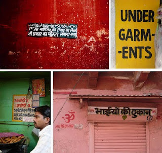
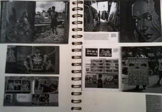 I managed to find an article on world art, this helped to show me how people get their messages across, and advertize in different countries. The part that stood out most were the pictures based in mumbai, and the bright colours used which are eye catching.After reading this, I decided to narrow my target audience down further, to 15-17 year old indian teenagers, in particular ones that have forgotten their culture, or that dont know much about it because of one reason or another. This meant that the final piece could quite literally be reminding them not to forget where they are from, and it will also have a facebook page set up by the pressure group, enabling them to be able to talk to other people their age, get information and get involved.
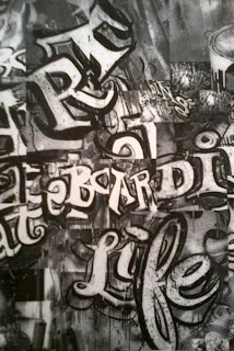
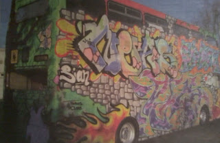 This image of graffiti stood out because of the range of colours used. I also looked at a graffiti artist whose work stood out to me becuase of the colours he used and the message behind some of the graffiti images, as oppose to it being a ‘tag’ or a name.
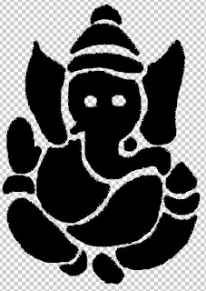
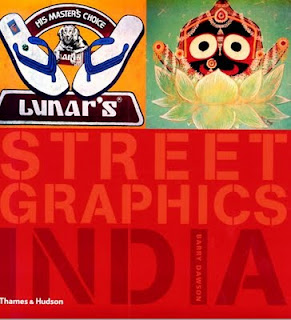
India street graphics book ---> Idea to use bright colours for the backround.


This is the graffiti I designed and coloured, there was no particular reason for doing this, i just thought that it would look better. The quote ‘remember where you’re from’, was chosen because it was one of the only quotes that doesnt sound like someone is preaching or trying to force people into it.
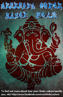
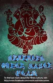
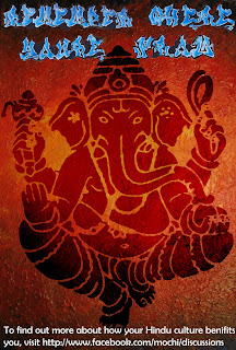
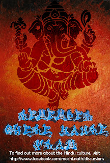
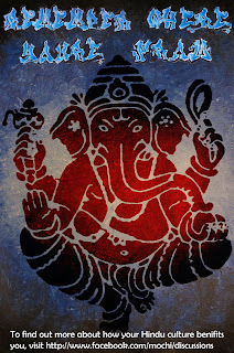
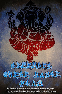
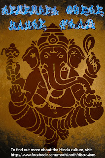
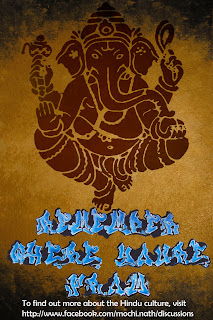
chose the Ganesh image as the final design for the leaflet because the aum looked too simple and vague. The Ganesh leaflet allows the audience to understand more about what the message is. The Ganesh was taken from the collage with all the iconic indian things. I changed an image into a stencil and used it as its a strong image. I then added the graffiti text that I designed, and the chosen stencil, and the short sentence with contact details linking to a facebook page, which is perfect for my target audience. I changed the image and text around, to something that looked better, however I will use both types with all the colours, as leaflets to hand out.