Make The World Seem A Better Place
We were asked to find a public place that we found to be ugly, mundane, boring uncared for or neglected. It had to be a place that allowed the public to pass through to somewhere more interesting like a waiting room, cafe or pub. The place had to be somewhere that was open to everyone.
We were then asked to explore, investigate and uncover the hidden beauty of the chosen place by producing image based work. The work had to reveal the hidden beauty of the place in the most interesting and engaging way as possible.
I started off looking at my local train station. This particular train station has no accessible ticket machines, no ticket office counter, no accessible toilets, no carparking, or wheelchair ramp. I didnt know where to start exactly so i ended up taking pictures of things and taking them into a group tutorial where I managed to get lots of feedback from people.


These three images above of the rubbish cans on the station were the ones that people commented on most and said stood out. I then decided that I would focus on the rubbish that people are throwing out onto the station which makes it seem a lot more dirty and abandoned. At first I thought of doing a poster but that wouldnt really be engaging with the people at the station as much as i could have been. By using the Kipling Method (also known as the 6 Thinking Men or 5 W's & 1 H) http://creatingminds.org/tools/kipling.htm to generate as many questions as possible about the object. The questions all start with either: Who, What, Where, When, Why and How. The aim was to start with obvious questions and then keep going till you're asking stranger and stranger questions. From that I got the idea of making a trash can out of the rubbish collected from the station.

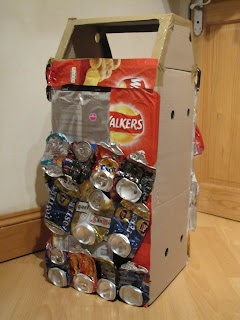
I started off with simple cardboard boxes and cut them out into the shape of a life sized box, i then worked on from there and used a glue gun to stick on bits of crisp packets and cans that were found on the station so that the bin appeared to be made completly out of rubbish.


The finished bin. I then put it on the station to see how many people noticed it and found that almost everyone saw the bin. People were asking about it even though they were already at their destination and didnt have to wait around anymore.


 In the image above, the man wanted to buy the bin after we had finished with it.


I enjoyed this project because I didnt do the m0st obvious thing that I could have done, and therefore I managed to answer the breif but in a unique way. I also enjoyed making the actual bin even though it was hard finding and cleaning a hundred cans and bits of rubbish that i could use to make the bin.


